New Visual Identity for Soldiers’
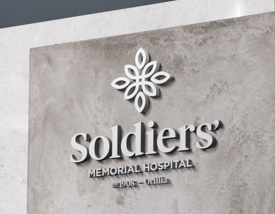
New Visual Identity blends hospital history with modern design
OSMH celebrated its 111th birthday in style this year, with a refresh of its visual identity ushering in a bold vision for the future that also pays tribute to the lives and sacrifices of the soldiers who are our namesake.
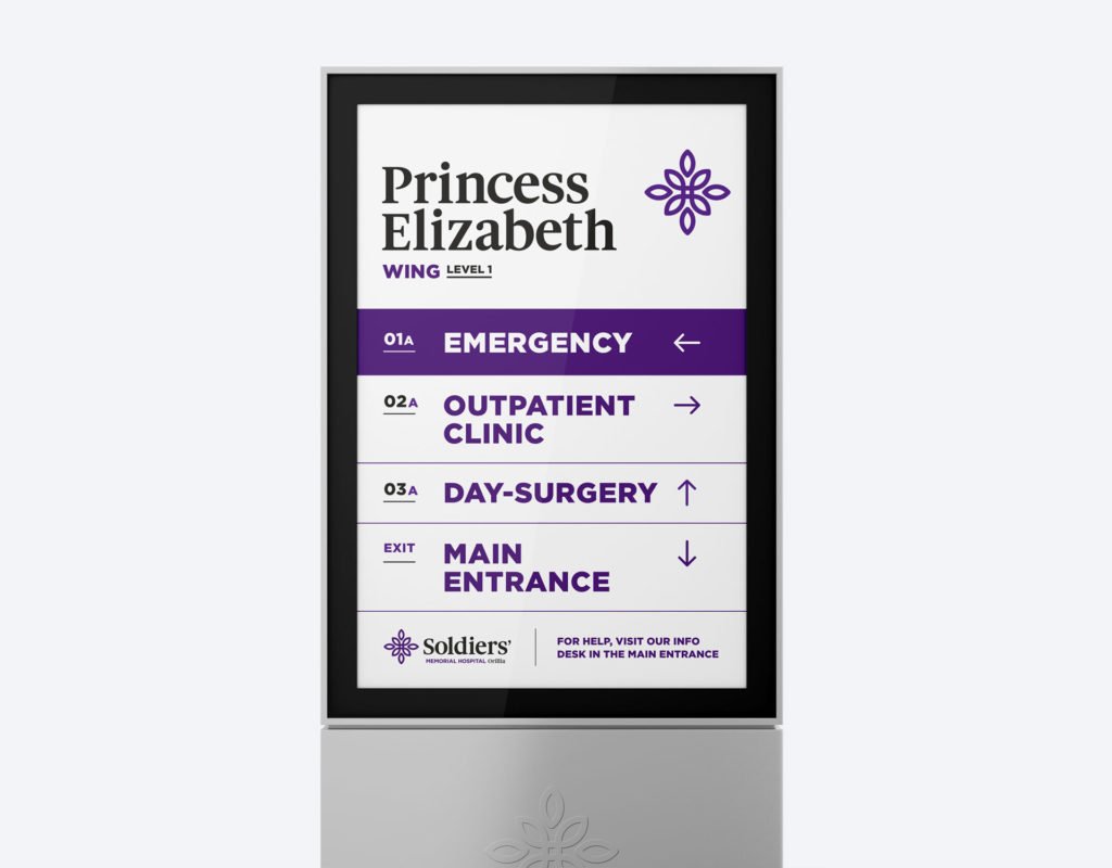
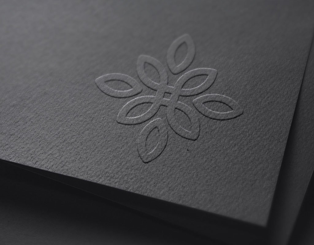
Anchored by a woven emblem inspired by the shape of a World War I service medal presented to more than 70,000 Canadians, the new logo strongly reinforces the hospital’s longstanding connection to local veterans. Formerly Orillia General Hospital, our hospital was renamed Orillia Soldiers’ Memorial Hospital in 1922 in honour of local soldiers who served in World War I.
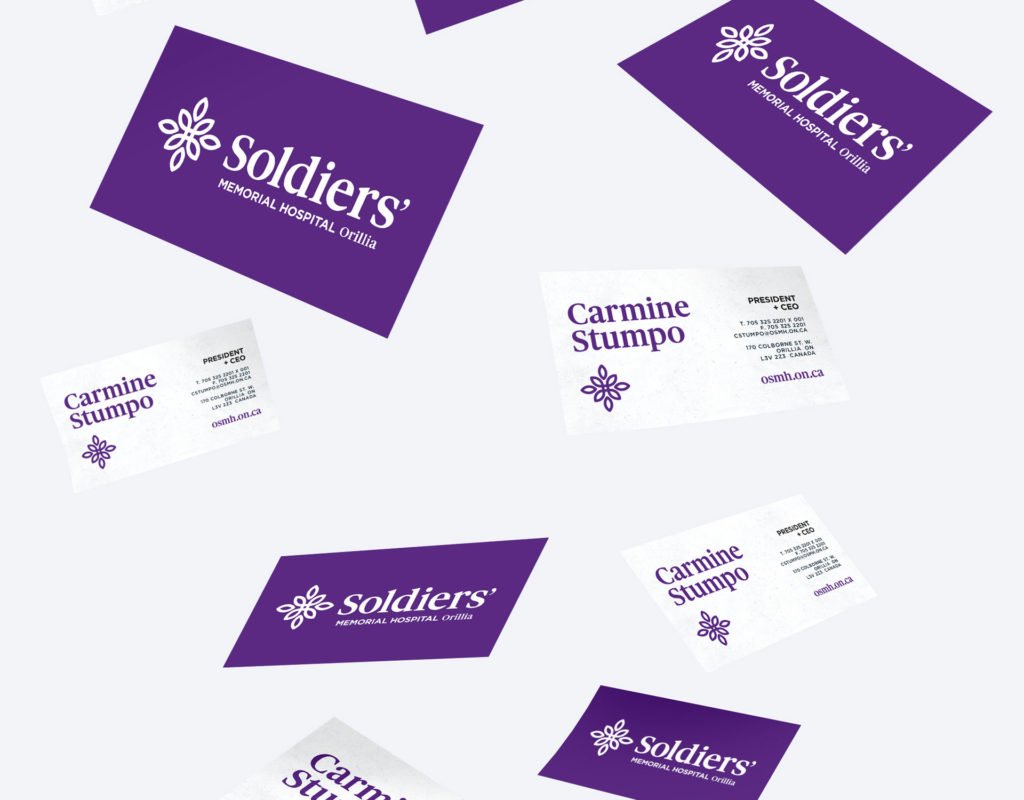
In step with the bold and unique new graphics, the colour scheme of the logo is predominantly purple, a strategic switch from the previous logo that incorporated blue, white and gold.
Many hospital logos are blue, and we wanted something different
“Many hospital logos are blue, and we wanted something different,” said Carmine Stumpo, OSMH President and CEO. “Purple is powerful and has connotations of strength, honour, and remembrance, and we feel it embodies much of what we strive to promote through our work. We’ve created a captivating new symbol with a compelling story behind it that will become easily recognizable to the community.”
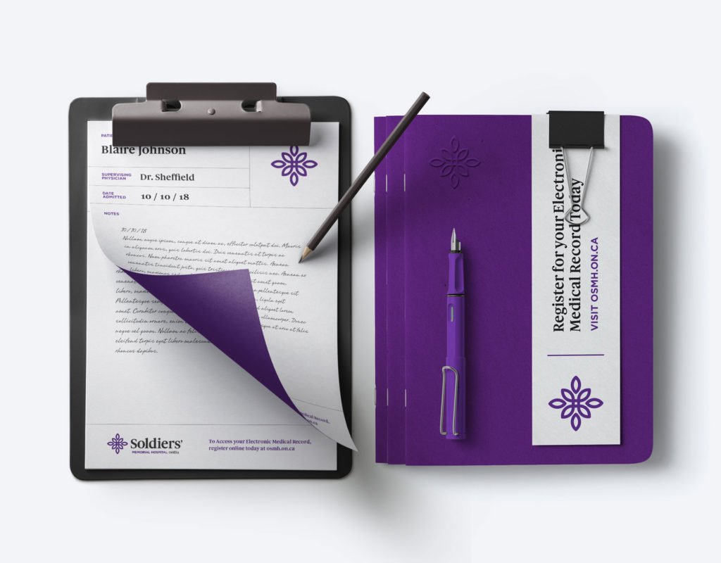
The previous hospital logo presented legibility and accessibility challenges. The outlined lettering and word order didn’t meet best practice standards for the visually impaired and the ornate design and writing inside the letter ‘o’, for example, wouldn’t replicate properly on smaller versions, or on embroidery placed on clothing.
The other primary design element is the enhanced prominence of the word ‘Soldiers’ which is a direct result of feedback received during the community consultation phase of the project.
“It’s the most common term that people use when referring to our hospital,” said Stumpo. “You’re not just going to the hospital, you’re going to Soldiers’, and that means something in our community”.
You’re not just going to the hospital, you’re going to Soldiers’, and that means something in our community.
While community feedback also expressed openness to a new design, there was a strong desire to maintain the name. As such, Orillia Soldiers’ Memorial Hospital remains intact.
Another driving factor behind the need for change was the stark difference between the visual identities of OSMH and the OSMH Foundation. About ten years ago, the Foundation introduced its own unique image to draw attention to fundraising efforts. While that worked at the time, it was determined that a similar image shared by both organizations, “is a better approach,” said Mark Riczu, Executive Director of the OSMH Foundation.
“We want our shared identity to reflect the important connection between the hospital and the Foundation, working together to improve the health of the community.”
Riczu also points out that studies have shown that a rebrand in the charitable sector can result in better fundraising performance, particularly as brand equity grows.
“Changes to an organization’s visual identity are important and should never be taken lightly or without appropriate consultation,” said Stumpo.
“For the past century, our name and visual identity have helped define who we are, how we respect and admire the values and commitment that soldiers have brought to their duties, and how we as a hospital strive to emulate those values in the work we do. Our visual identity reflects that commitment. It has evolved over time, but always with the same intent of honouring our past, acknowledging the present, and leading us into the future.”
-
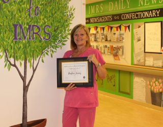
Integrated Medicine and Rehab Services Nurse Darlene Jermey wins 2026 OSMH Nightingale Award for exceptional compassion and care Integrated Medicine and Rehab Services Nurse Darlene Jermey wins 2026 OSMH Nightingale Award for exceptional compassion and ...
![Integrated Medicine and Rehab Services Nurse Darlene Jermey wins 2026 OSMH Nightingale Award for exceptional compassion and care]()
-
Accredited with Exemplary Standing Exemplary Standing awarded to OSMH following on-site Accreditation Survey (Orillia, ON) – Accreditation Canada, the independent organization ...
![Accredited with Exemplary Standing]()
-
Five new medical residents eager to join already expanding Orillia FMTU (Orillia, ON) – As the Orillia Family Medicine Teaching Unit (FMTU) prepares to enter its second year ...
![Five new medical residents eager to join already expanding Orillia FMTU]()